Impossible List - 15 June
How far I've come over the course of the last month in regards to the impossible list of goals I've set for myself.
I've made a thing. It's a live map of the world that colour-codes every country based on how much the Foreign, Commonwealth & Development Office thinks you should avoid going there.
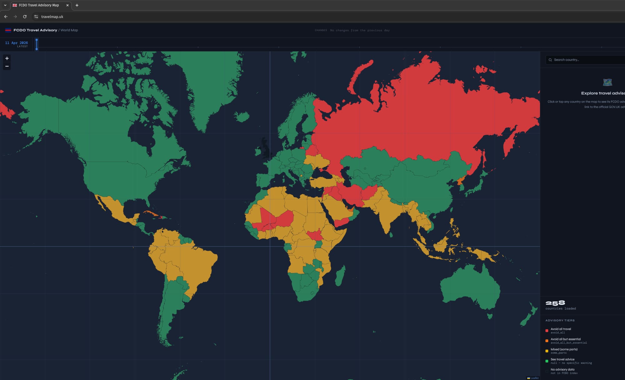
I've made a thing. It's a live map of the world that colour-codes every country based on how much the Foreign, Commonwealth & Development Office thinks you should avoid going there. It updates itself every day, which means I don't have to, and that feels like a personal victory.
The FCDO publishes travel advisories for basically everywhere, but their website is about as user-friendly as a tax return. Want to compare multiple destinations? Enjoy opening seventeen different tabs and trying to remember whether Thailand was "avoid some parts" or "see travel advice." It's the sort of interface that makes you question your life choices.
So I built a map that does all that at once. Click a country, see if it's on fire. Simple.
The whole thing uses four colours, because that's all you need to convey "probably fine" through to "absolutely do not go there under any circumstances."
Red means the FCDO advises against all travel. Your travel insurance will laugh at you. British nationals are strongly encouraged to be literally anywhere else.
Orange is "avoid all but essential travel," which is government-speak for "you can go, but if something goes wrong, we're going to say we told you so."
Yellow means some parts of the country are problematic, but other bits are fine. These are the ones with zone-specific maps showing exactly which regions to avoid, which is helpful if you're the sort of person who enjoys precision in your travel warnings.
Green is "see travel advice," which basically means "we haven't got specific concerns, but do check the website because things change and we're covering our backs here."
Countries not in the FCDO index appear in dark grey, which either means they're fine or the FCDO hasn't got round to writing about them yet. Bit of a gamble, that one.
Click any country and a panel appears with all the relevant information a person might need: the flag, the capital, how many people live there, what languages they speak, and a short Wikipedia summary in case you've forgotten where the place actually is.
You also get the current FCDO advisory tier with an explanation that's slightly less bureaucratic than the original, a direct link to the full GOV.UK advice (because I'm not qualified to make travel decisions for you), and a little badge showing whether things have got better or worse since yesterday.
For countries with mixed advisories, there's a map image showing exactly which bits to avoid. This is quite useful if you're the sort of person who likes to stand on borders and wave at places you're not allowed to enter.
There's a timeline slider at the top that lets you scrub through every daily snapshot since I started collecting them. You can watch how advisories changed during various geopolitical events, which is either fascinating or deeply depressing depending on your worldview.
You can literally see instability spread across borders, or watch regions gradually calm down after conflicts end. It's like a very slow-motion disaster film, except it's real and you can't turn it off.
There's a search function in the sidebar. Type "Fra" and France pops up. Type "Thai" and it zooms to Thailand. This may not sound revolutionary, but have you ever tried to find a specific country on most government websites? They're invariably sorted in some baffling order that makes you question whether alphabetisation is a conspiracy.
Every morning at 06:30 UTC, a script wakes up and scrapes the GOV.UK Content API for all the latest travel advisory data. If anything's changed, it commits a new snapshot and the site updates itself. If nothing's changed, it goes back to sleep. The whole thing runs on GitHub Actions, which is free, so I'm not paying to keep this running.
The site itself is embarrassingly simple. One HTML file. One CSS file. One JavaScript file. No server, no database, no authentication, no build process. Just open it in a browser and it works.
The map uses Leaflet.js to render Natural Earth polygon data, each country colour-coded by matching its ISO code against the snapshot. Country details (flags, capitals, populations) are fetched from the REST Countries API when you click something. Wikipedia summaries come from the Wikipedia API. Both are cached so you're not hammering their servers every time you click the same country twice.
For countries with zone-specific warnings, the FCDO publishes PDF maps. I download those, convert them to JPEGs, and display them inline. This is the only part of the process that feels like actual work, which is probably why I automated it.
The entire thing costs precisely £0 to run. GitHub Pages hosts it for free. All the APIs are free. I'm not even paying for a domain because it just lives on GitHub's infrastructure. This is the sort of project that makes you wonder why everything else costs money.
Trip planning: If you're planning a multi-country route through somewhere like Southeast Asia, you can check each destination in about thirty seconds instead of spending an hour opening tabs and forgetting what you've already checked.
Corporate travel policy: Companies can use the timeline to see whether their approval processes aligned with FCDO advice during past events. Useful for audits, or for winning arguments about whether someone really should have been sent to that conference.
Journalism: The timeline provides a visual record of how crises unfolded. You can track advisory escalations in the lead-up to conflicts or watch the gradual improvement after peace agreements. It's surprisingly effective for illustrating geopolitical shifts.
Teaching: If you're trying to explain current events to students, showing them where things are actually happening is more effective than just talking about it. The map gives context that's difficult to convey with words alone.
I've got a vague idea about integrating GDELT conflict data, so you could overlay actual events against travel advisories and see whether they correlate. I might refactor the code to make it less embarrassing. I should probably optimise it for mobile.
But realistically, it works as it is, and I'm a firm believer in not fixing things that aren't broken. The entire point of this project was to make checking travel advisories less annoying, and it does that. Everything beyond that is just procrastination with extra steps.
The code's on GitHub if anyone wants to contribute, though I suspect most people have better things to do with their time than improve a travel advisory map. Fair enough, honestly.
Government travel advisories are genuinely important information, but they're presented in the sort of format that makes you want to give up before you've started. Text-heavy pages. Different entries for different countries. No easy way to compare destinations or track changes over time.
This map centralises all of that into one interface where you can actually see what's happening at a glance. It's visual, it's comparable, it's searchable, and it updates itself every day without me having to remember to do anything.
Whether you're checking on a relative's gap year plans, tracking geopolitical trends for work, or just planning your next holiday somewhere that won't result in a hostage negotiation, having all this information in one place is objectively more useful than the alternative.
I'm not claiming this is revolutionary. It's just a map with some colour coding and a search box. But sometimes the simple solutions are the ones that actually get used, and that feels like reason enough to have built it.